GoodRx Style Guide
GoodRx Logos
SVG logo with different sizesPRIMARY LOGO
- Large size logo class="logo-large"
- Medium size logo class="logo-medium"
- Small size logo class="logo-small"
- xSmall size logo class="logo-xsmall"
SECONDARY LOGO
Spacing and Gaps - with Margins
Following classes can be used with any tag- class="margin-10" is for 10px margin for All the sides
- class="margin-15" is for 15px margin for All the sides
- class="margin-20" is for 20px margin for All the sides
- class="margin-top-bottom-10" is for 10px margins from Top and Bottom while Left and Right 0px
- class="margin-top-bottom-15" is for 15px margins from Top and Bottom while Left and Right 0px
- class="margin-top-bottom-20" is for 20px margins from Top and Bottom while Left and Right 0px
- class="margin-top-bottom-10-auto" is for 10px margins from Top and Bottom while Left and Right auto
- class="margin-top-bottom-15-auto" is for 15px margins from Top and Bottom while Left and Right auto
- class="margin-top-bottom-20-auto" is for 20px margins from Top and Bottom while Left and Right auto
- class="margin-left-right-10" is for 10px margins from Right and Left while Top and Bottom 0px
- class="margin-left-right-15" is for 15px margins from Right and Left while Top and Bottom 0px
- class="margin-left-right-20" is for 20px margins from Right and Left while Top and Bottom 0px
- class="margin-left-right-10-auto" is for 10px margins from Right and Left while Top and Bottom auto
- class="margin-left-right-15-auto" is for 15px margins from Right and Left while Top and Bottom auto
- class="margin-left-right-20-auto" is for 20px margins from Right and Left while Top and Bottom auto
- class="margin-left-10, 15, 20" is for 10px, 15px, 20px margin from Left
- class="margin-right-10, 15, 20" is for 10px, 15px, 20px margin from Right
- class="margin-top-10, 15, 20" is for 10px, 15px, 20px margin from Top
- class="margin-bottom-10, 15, 20" is for 10px, 15px, 20px margin from Bottom
- class="no-margin" is for 0px margin for All the sides
- class="no-margin-left" is for 0px margin from Left
- class="no-margin-right" is for 0px margin from Right
- class="no-margin-top" is for 0px margin from Top
- class="no-margin-bottom" is for 0px margin from Bottom
Spacing and Gaps - with Padding
Following classes can be used with any tag- class="padding-10" is for 10px padding for All the sides
- class="padding-15" is for 15px padding for All the sides
- class="padding-20" is for 20px padding for All the sides
- class="padding-top-bottom-10" is for 10px padding for Top and Bottom while Left and Right 0px
- class="padding-top-bottom-15" is for 15px padding for Top and Bottom while Left and Right 0px
- class="padding-top-bottom-20" is for 20px padding for Top and Bottom while Left and Right 0px
- class="padding-top-bottom-10-auto" is for 10px padding for Top and Bottom while Left and Right auto
- class="padding-top-bottom-15-auto" is for 15px padding for Top and Bottom while Left and Right auto
- class="padding-top-bottom-20-auto" is for 20px padding for Top and Bottom while Left and Right auto
- class="padding-left-right-10" is for 10px padding from Right and Left while Top and Bottom 0px
- class="padding-left-right-15" is for 15px padding from Right and Left while Top and Bottom 0px
- class="padding-left-right-20" is for 20px padding from Right and Left while Top and Bottom 0px
- class="padding-left-right-10-auto" is for 10px padding from Right and Left while Top and Bottom auto
- class="padding-left-right-15-auto" is for 15px padding from Right and Left while Top and Bottom auto
- class="padding-left-right-20-auto" is for 20px padding from Right and Left while Top and Bottom auto
- class="padding-left-10, 15, 20" is for 10px, 15px, 20px padding from Left
- class="padding-right-10, 15, 20" is for 10px, 15px, 20px padding from Right
- class="padding-top-10, 15, 20" is for 10px, 15px, 20px padding from Top
- class="padding-bottom-10, 15, 20" is for 10px, 15px, 20px padding from Bottom
- class="no-padding" is for 0px padding for All the sides
- class="no-padding-left" is for 0px padding from Left
- class="no-padding-right" is for 0px padding from Right
- class="no-padding-top" is for 0px padding from Top
- class="no-padding-bottom" is for 0px padding from Bottom
Primary ColorS
| GoodRx Yellow | ||||
| HEX | #FDDB00 | |||
| RGB | 253 | 219 | 0 | |
| CMYK | 0% | 5% | 100% | 0% |
| GoodRx Light Yellow 1 | ||||
| HEX | #FFE433 | |||
| RGB | 255 | 228 | 51 | |
| CMYK | 0% | 4% | 88% | 0% |
| GoodRx Light Yellow 2 | ||||
| HEX | #FEE960 | |||
| RGB | 254 | 233 | 96 | |
| CMYK | 0% | 2% | 68% | 0% |
| GoodRx Light Yellow 3 | ||||
| HEX | #FEEF90 | |||
| RGB | 254 | 239 | 144 | |
| CMYK | 0% | 2% | 44% | 0% |
| GoodRx Light Yellow 4 | ||||
| HEX | #FFF6BF | |||
| RGB | 255 | 246 | 191 | |
| CMYK | 1% | 1% | 29% | 0% |
| GoodRx Light Yellow 5 | ||||
| HEX | #FFFADB | |||
| RGB | 255 | 250 | 219 | |
| CMYK | 0% | 0% | 18% | 0% |
| GoodRx Light Yellow 6 | ||||
| HEX | #FFFDEF | |||
| RGB | 255 | 253 | 239 | |
| CMYK | 0% | 0% | 6% | 0% |
| GoodRx Black | ||||
| HEX | #201F1B | |||
| RGB | 32 | 31 | 27 | |
| CMYK | 76% | 65% | 66% | 90% |
| GoodRx Light Gray 1 | ||||
| HEX | #575757 | |||
| RGB | 87 | 87 | 87 | |
| CMYK | 63% | 52% | 44% | 33% |
| GoodRx Light Gray 2 | ||||
| HEX | #757575 | |||
| RGB | 117 | 117 | 117 | |
| CMYK | 50% | 40% | 34% | 17% |
| GoodRx Light Gray 3 | ||||
| HEX | #ABABAB | |||
| RGB | 171 | 171 | 171 | |
| CMYK | 33% | 24% | 20% | 2% |
| GoodRx Light Gray 4 | ||||
| HEX | #D9D9D7 | |||
| RGB | 217 | 217 | 215 | |
| CMYK | 10% | 7% | 5% | 0% |
| GoodRx Light Gray 5 | ||||
| HEX | #EBEBE9 | |||
| RGB | 235 | 235 | 233 | |
| CMYK | 7% | 5% | 6% | 0% |
| GoodRx Light Gray 6 | ||||
| HEX | #F7F7F4 | |||
| RGB | 247 | 247 | 244 | |
| CMYK | 2% | 1% | 3% | 0% |
| GoodRx Off-White | ||||
| HEX | #FFFFFB | |||
| RGB | 255 | 255 | 251 | |
| CMYK | 0% | 0% | 1% | 0% |
| Pure White | ||||
| HEX | #FFFFFF | |||
| RGB | 255 | 255 | 255 | |
| CMYK | 0% | 0% | 0% | 0% |
SECONDARY ColorS
| GoodRx Blue | ||||
| HEX | #0F56A6 | |||
| RGB | 15 | 86 | 166 | |
| CMYK | 0% | 0% | 0% | 0% |
| GoodRx Digital Blue 1 | ||||
| HEX | #1D74DE | |||
| RGB | 29 | 116 | 222 | |
| CMYK | 0% | 0% | 0% | 0% |
| GoodRx Light Blue 1 | ||||
| HEX | #E6F2FC | |||
| RGB | 230 | 242 | 252 | |
| CMYK | 0% | 0% | 0% | 0% |
| GoodRx Light Blue 2 | ||||
| HEX | #F7FCFC | |||
| RGB | 247 | 252 | 252 | |
| CMYK | 4% | 0% | 2% | 0% |
| GoodRx Green | ||||
| HEX | #0F7778 | |||
| RGB | 21 | 96 | 66 | |
| CMYK | 96% | 2% | 80% | 47% |
| GoodRx Digital Green | ||||
| HEX | #139092 | |||
| RGB | 0 | 142 | 87 | |
| CMYK | 0% | 0% | 0% | 0% |
| GoodRx Light Green | ||||
| HEX | #E6F6EC | |||
| RGB | 230 | 246 | 236 | |
| CMYK | 0% | 0% | 0% | 0% |
| GoodRx Light Green 2 | ||||
| HEX | #F7FFF9 | |||
| RGB | 247 | 255 | 249 | |
| CMYK | 5% | 0% | 6% | 0% |
| GoodRx Orange | ||||
| HEX | #B24B01 | |||
| RGB | 171 | 77 | 0 | |
| CMYK | 0% | 0% | 0% | 0% |
| GoodRx Digital Orange | ||||
| HEX | #E96201 | |||
| RGB | 245 | 145 | 15 | |
| CMYK | 0% | 0% | 0% | 0% |
| GoodRx Light Orange 1 | ||||
| HEX | #FFEADA | |||
| RGB | 255 | 222 | 196 | |
| CMYK | 0% | 0% | 0% | 0% |
| GoodRx Light Orange 2 | ||||
| HEX | #FDF9F5 | |||
| RGB | 253 | 246 | 244 | |
| CMYK | 0% | 0% | 0% | 0% |
| GoodRx Red | ||||
| HEX | #A72E18 | |||
| RGB | 143 | 37 | 4 | |
| CMYK | 0% | 0% | 0% | 0% |
| GoodRx Digital Red | ||||
| HEX | #D13216 | |||
| RGB | 209 | 71 | 21 | |
| CMYK | 0% | 0% | 0% | 0% |
| GoodRx Light Red 1 | ||||
| HEX | #FFE7E7 | |||
| RGB | 255 | 231 | 231 | |
| CMYK | 0% | 0% | 0% | 0% |
| GoodRx Light Red 2 | ||||
| HEX | #FFF6F4 | |||
| RGB | 255 | 246 | 244 | |
| CMYK | 0% | 0% | 0% | 0% |
Typography / Fonts
Custom Typography
Heading styles: GoodRx Moon
a b c d e f g h i j k l m n o p q r s t u v w x y z
a b c d e f g h i j k l m n o p q r s t u v w x y z
1 2 3 4 5 6 7 8 9 0 + - \ * =
~ ` ! @ # % ^ & ( ) { } _ | / ? < > . ,
a b c d e f g h i j k l m n o p q r s t u v w x y z
a b c d e f g h i j k l m n o p q r s t u v w x y z
1 2 3 4 5 6 7 8 9 0 + - \ * =
~ ` ! @ # % ^ & ( ) { } _ | / ? < > . ,
a b c d e f g h i j k l m n o p q r s t u v w x y z
a b c d e f g h i j k l m n o p q r s t u v w x y z
1 2 3 4 5 6 7 8 9 0 + - \ * =
~ ` ! @ # % ^ & ( ) { } _ | / ? < > . ,
Body & UI styles: GoodRx Bolton
a b c d e f g h i j k l m n o p q r s t u v w x y z
a b c d e f g h i j k l m n o p q r s t u v w x y z
1 2 3 4 5 6 7 8 9 0 + - \ * =
~ ` ! @ # % ^ & ( ) { } _ | / ? < > . ,
a b c d e f g h i j k l m n o p q r s t u v w x y z
a b c d e f g h i j k l m n o p q r s t u v w x y z
1 2 3 4 5 6 7 8 9 0 + - \ * =
~ ` ! @ # % ^ & ( ) { } _ | / ? < > . ,
a b c d e f g h i j k l m n o p q r s t u v w x y z
a b c d e f g h i j k l m n o p q r s t u v w x y z
1 2 3 4 5 6 7 8 9 0 + - \ * =
~ ` ! @ # % ^ & ( ) { } _ | / ? < > . ,
Google Equivalents
Heading styles: Poppins
a b c d e f g h i j k l m n o p q r s t u v w x y z
a b c d e f g h i j k l m n o p q r s t u v w x y z
1 2 3 4 5 6 7 8 9 0 + - \ * =
~ ` ! @ # % ^ & ( ) { } _ | / ? < > . ,
a b c d e f g h i j k l m n o p q r s t u v w x y z
a b c d e f g h i j k l m n o p q r s t u v w x y z
1 2 3 4 5 6 7 8 9 0 + - \ * =
~ ` ! @ # % ^ & ( ) { } _ | / ? < > . ,
a b c d e f g h i j k l m n o p q r s t u v w x y z
a b c d e f g h i j k l m n o p q r s t u v w x y z
1 2 3 4 5 6 7 8 9 0 + - \ * =
~ ` ! @ # % ^ & ( ) { } _ | / ? < > . ,
Body & UI styles: Inter
a b c d e f g h i j k l m n o p q r s t u v w x y z
a b c d e f g h i j k l m n o p q r s t u v w x y z
1 2 3 4 5 6 7 8 9 0 + - \ * =
~ ` ! @ # % ^ & ( ) { } _ | / ? < > . ,
a b c d e f g h i j k l m n o p q r s t u v w x y z
a b c d e f g h i j k l m n o p q r s t u v w x y z
1 2 3 4 5 6 7 8 9 0 + - \ * =
~ ` ! @ # % ^ & ( ) { } _ | / ? < > . ,
a b c d e f g h i j k l m n o p q r s t u v w x y z
a b c d e f g h i j k l m n o p q r s t u v w x y z
1 2 3 4 5 6 7 8 9 0 + - \ * =
~ ` ! @ # % ^ & ( ) { } _ | / ? < > . ,
basic Headings
Use tags h1 to h6 for get necessary headingH1 - Bold 30px - Capitalized
H2 - Bold 28px - Capitalized
H3 - Bold 24px - Capitalized
H4 - Bold 20px - Capitalized
H5 - Bold 18px - Capitalized
H6 - Bold 16px - Capitalized
Uppercase Heading
Use tags h1 to h6 with class="all-caps" for get necessary uppercase headingH1 - Bold 30px - Uppercase
H2 - Bold 28px - Uppercase
H3 - Bold 24px - Uppercase
H4 - Bold 20px - Uppercase
H5 - Bold 18px - Uppercase
H6 - Bold 16px - Uppercase
Default Paragraph / Body Copy
Default Paragraph tag <p></p> or class="text-size-16"text-size: 16px and line-height: 30px sample Lorem ipsum dolor sit amet, consectetur adipiscing elit, sed do eiusmod tempor incididunt ut labore et dolore magna aliqua. Ut enim ad minim veniam, quis nostrud exercitation ullamco laboris nisi ut aliquip ex ea commodo consequat.
Medium Size Paragraph / Body Copy
Use with any tag with class="text-size-14"text-size: 14px and line-height: 30px sample Lorem ipsum dolor sit amet, consectetur adipiscing elit, sed do eiusmod tempor incididunt ut labore et dolore magna aliqua. Ut enim ad minim veniam, quis nostrud exercitation ullamco laboris nisi ut aliquip ex ea commodo consequat.
Large Size Paragraph / Body Copy
Use with any tag class="text-size-18"text-size: 18px and line-height: 30px sample Lorem ipsum dolor sit amet, consectetur adipiscing elit, sed do eiusmod tempor incididunt ut labore et dolore magna aliqua. Ut enim ad minim veniam, quis nostrud exercitation ullamco laboris nisi ut aliquip ex ea commodo consequat.
All Capital Letters
Use with any tag class="all-caps"Lorem ipsum dolor sit amet, consectetur adipiscing elit, sed do eiusmod tempor incididunt ut labore et dolore magna aliqua. Ut enim ad minim veniam, quis nostrud exercitation ullamco laboris nisi ut aliquip ex ea commodo consequat.
Bolder Text
Use with any tag with class="bolder-text"font-weight: 700 Lorem ipsum dolor sit amet, consectetur adipiscing elit, sed do eiusmod tempor incididunt ut labore et dolore magna aliqua. Ut enim ad minim veniam, quis nostrud exercitation ullamco laboris nisi ut aliquip ex ea commodo consequat.
Bold Text
Use with any tag with class="bold-text""font-weight: 600 Lorem ipsum dolor sit amet, consectetur adipiscing elit, sed do eiusmod tempor incididunt ut labore et dolore magna aliqua. Ut enim ad minim veniam, quis nostrud exercitation ullamco laboris nisi ut aliquip ex ea commodo consequat.
Capitalized Text
Use with any tag with class="text-capitalize"Lorem ipsum dolor sit amet, consectetur adipiscing elit, sed do eiusmod tempor incididunt ut labore et dolore magna aliqua. Ut enim ad minim veniam, quis nostrud exercitation ullamco laboris nisi ut aliquip ex ea commodo consequat.
Small Text
Use with any tag with class="text-size-12"text-size: 12px and line-height: 16px sample Lorem ipsum dolor sit amet, consectetur adipiscing elit, sed do eiusmod tempor incididunt ut labore et dolore magna aliqua. Ut enim ad minim veniam, quis nostrud exercitation ullamco laboris nisi ut aliquip ex ea commodo consequat.
Separators
Icons
Icons are from fontawesome.com full icon set available here- ambulance
- f0f9
- angle-double-down
- f103
- angle-double-left
- f100
- angle-double-right
- f101
- angle-double-up
- f102
- angle-down
- f107
- angle-left
- f104
- angle-right
- f105
- angle-up
- f106
- arrow-down
- f063
- arrow-left
- f060
- arrow-right
- f061
- arrow-up
- f062
- at
- f1fa
- asterisk
- f069
- bell
- f0f3
- bone
- f5d7
- box
- f466
- calendar
- f133
- calendar-alt
- f073
- camera
- f030
- capsules
- f46b
- caret-down
- f0d7
- caret-left
- f0d9
- caret-right
- f0da
- caret-up
- f0d8
- cat
- f6be
- check
- f00c
- check-circle
- f058
- check-square
- f14a
- chevron-down
- f078
- chevron-left
- f053
- chevron-right
- f054
- chevron-up
- f077
- clock
- f017
- cog
- f013
- comment
- f075
- comments
- f086
- credit-card
- f09d
- crow
- f520
- directions
- f5eb
- dog
- f6d3
- dollar-sign
- f155
- dove
- f4ba
- download
- f019
- drumstick-bite
- f6d7
- egg
- f7fb
- ellipsis-h
- f141
- ellipsis-v
- f142
- envelope
- f0e0
- envelope-open
- f2b6
- exclamation
- f12a
- exclamation-circle
- f06a
- exclamation-triangle
- f071
- file-pdf
- f1c1
- filter
- f0b0
- heart
- f004
- home
- f015
- horse
- f6f0
- image
- f03e
- images
- f302
- info-circle
- f05a
- key
- f084
- link
- f0c1
- location-arrow
- f124
- lock
- f023
- map-marker-alt
- f3c5
- paper-plane
- f1d8
- paperclip
- f0c6
- pen
- f304
- pencil-alt
- f303
- phone
- f095
- pills
- f484
- play
- f04b
- plus
- f067
- plus-circle
- f055
- plus-square
- f0fe
- search
- f002
- share
- f064
- shopping-cart
- f07a
- star
- f005
- star-half
- f089
- star-half-alt
- f5c0
- times
- f00d
- times-circle
- f057
- trash
- f1f8
- trash-alt
- f2ed
- truck
- f0d1
- user-alt
- f406
- user-circle
- f2bd
- video
- f03d
- file-export
- f56e
Social Icons
Icons are from fontawesome.com full icon set available here- f09a
- facebook-f
- f39e
- facebook-square
- f082
- f16d
- instagram-square
- e055
- f08c
- linkedin-in
- f0e1
- f0d2
- pinterest-p
- f231
- pinterest-square
- f0d3
- snapchat
- f2ab
- snapchat-ghost
- f2ac
- snapchat-square
- f2ad
- f099
- twitter-square
- f081
- f232
- whatsapp-square
- f40c
- youtube
- f167
- youtube-square
- f431
Line Icons
Icons are from fontawesome.com full icon set available here- arrow-alt-circle-down
- f358
- arrow-alt-circle-left
- f359
- arrow-alt-circle-right
- f35a
- arrow-alt-circle-up
- f35b
- bell
- f0f3
- calendar
- f133
- calendar-alt
- f073
- caret-square-down
- f150
- caret-square-left
- f191
- caret-square-right
- f152
- caret-square-up
- f151
- check-circle
- f058
- check-square
- f14a
- clock
- f017
- comment
- f075
- comment-alt
- f27a
- comment-dots
- f4ad
- comments
- f086
- credit-card
- f09d
- edit
- f044
- envelope
- f0e0
- file-pdf
- f1c1
- heart
- f004
- image
- f03e
- paper-plane
- f1d8
- plus-square
- f0fe
- question-circle
- f059
- registered
- f25d
- star
- f005
- star-half
- f089
- sun
- f185
- times-circle
- f057
- trash-alt
- f2ed
- user
- f007
- user-circle
- f2bd
- window-close
- f410
Layout / Grid System
Borrowed Bootstrap Grid for this layout system full guide available hereGrid options
While Bootstrap uses ems or rems for defining most sizes, pxs are used for grid breakpoints and container widths. This is because the viewport width is in pixels and does not change with the font size.
See how aspects of the Bootstrap grid system work across multiple devices with a handy table.
|
Extra small <576px |
Small ≥576px |
Medium ≥768px |
Large ≥992px |
Extra large ≥1200px |
|
|---|---|---|---|---|---|
| Max container width | None (auto) | 540px | 720px | 960px | 1140px |
| Class prefix | .col- |
.col-sm- |
.col-md- |
.col-lg- |
.col-xl- |
| # of columns | 12 | ||||
| Gutter width | 30px (15px on each side of a column) | ||||
| Nestable | Yes | ||||
| Column ordering | Yes | ||||
4 Column Item Grid
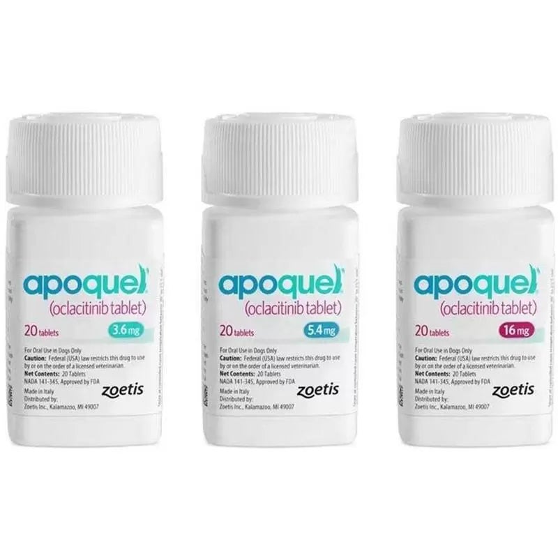
Apoquel TabletRx
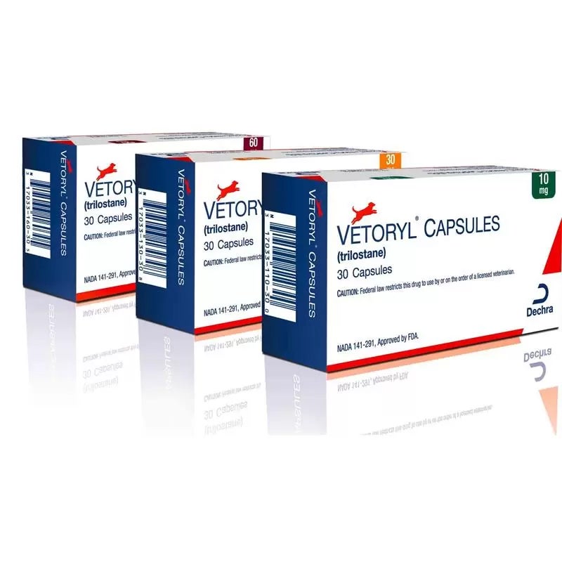
Vetoryl Capsules 30 Ct.Rx
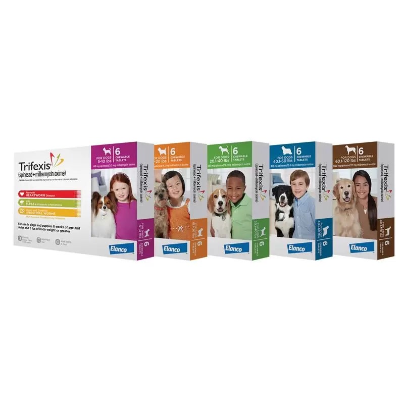
Trifexis Chewable Tablets for DogsRx
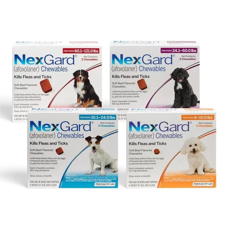
Nexgard for Dogs and PuppiesRx
6 Column / Homepage Item Grid
Apoquel TabletRx
Vetoryl Capsules 30 Ct.Rx
Trifexis Chewable Tablets for DogsRx
Nexgard for Dogs and PuppiesRx
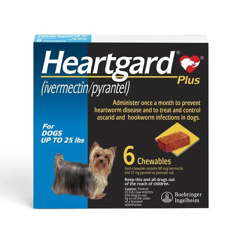
Heartgard Plus Chewables For DogsRx
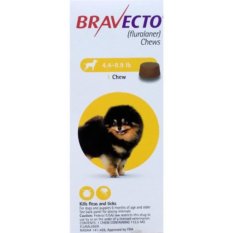
Bravecto ChewsRx
3 Column / Product Listing Grid
Vetoryl Capsules 30 Ct.Rx
Trifexis Chewable Tablets for DogsRx
Nexgard for Dogs and PuppiesRx
HYPERLINK BUTTONS
Buttons using <button> and <a> tag with icon- Default <a> tag without any class
- Using <a> tag with any color class e.g. class="text-color-orange", class="text-color-black" etc.
- Using <a> tag with class="underline"
Elements
Buttons, Forms Inputs, etc.Buttons
Primary, Secondary, and Alternative ButtonsPrimary
Primary - Alternative
Secondary
ActiveTertiary
ActiveQuaternary
ActiveFULL WIDTH BUTTONS
Full width Primary and Secondary ButtonsPrimary Full Width
Primary Full Width - Alternative
Secondary Full Width
Tertiary Full Width
Quaternary
ICONS BUTTONS
Primary
Primary - Alternative
Secondary
Secondary - Alternative
Buttons with Icons
Primary
Primary - Alternative
Secondary
Secondary - Alternative
Top contact bar
Shipping, Call, Fax, Live Chat.Header
Logo, Search and Buttons
Elements
Form Inputs, Textarea, Select etc.text field
Text field states.select box
Select box/drop down styles.checkbox AND radio button
Checkbox states.radio button
States and animation.Borders
Different Border style and width- Use with any tag class="borders" for this 1px border width
- For roundness use class="borders + rounded, rounded-5, rounded-8 and rounded-10" defaut class="rounded" is 3px
- For border color use class="borders + blue-border or orange-border"
- For border style use class="borders + dashed or dotted"
Shadows
Box Shadows and Shadow styles- Use with any tag class="box-shadow" for 3px shadow
- For 5px shadow class="box-shadow-5"
- For 10px shadow class="box-shadow-10"
- For 25px shadow class="box-shadow-25"
Error, Warning, Notification etc.
Different color boxes for different scenarios- Use with any tag class="borders + rounded + error-box"
- For warning box use class="borders + rounded + warning-box"
- For showing notification use class="borders + rounded + notification-box"
- For successful action use class="borders + rounded + happy-box"